This is the third in an eight-part article series.
STEP 3: COLOR & CONTRAST
Color and Contrast Best Practices for Accessibility
As part of our series of articles on what is required to ensure PDF documents are accessible, we will be discussing color and proper contrast. The WCAG 2.0 standards address both issues and it is probably best to start there when laying out the requirements for proper use of color and contrast.
Color Considerations for Accessible Designs
The WCAG 2.0 Criterion 1.4.1 states the following regarding use of color:
“Color is not used as the only visual means of conveying information, indicating an action, prompting a response, or distinguishing a visual element.”
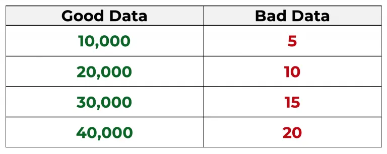
What does this mean in plain English? It is straightforward as there is no actual restriction in the use of a color in a document, with the exception that some colors may not be a good choice when we discuss proper contrast. What this does mean is that you cannot use color alone to represent important information, determine a response or to represent a visual content. A simple example that is commonly used by authors is to use green text to indicate good information and red text to indicate negative information. While there is nothing wrong with the red or green text, if the only way to determine what is good or bad information is indicated by color choices, this represents a failure of the WCAG 2.0 Criterion 1.4.1 requirements, where color cannot be the only means to convey the different meaning of the text. One way to resolve the problem above would be to have the good data in a table column and the bad data in the other column with a proper heading above the table columns indicating the good and bad data. This way you can still use the color choices but there is more than one way to differentiate the good and bad data.
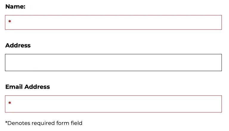
A similar situation is often used for Forms when listing mandatory fields. It is common practice to mark these mandatory fields in red text to indicate they must be completed. Using red text alone to indicate the mandatory fields is a violation of the WCAG 2.0 Criterion 1.4.1. There needs to be more than just the use of color in indicating mandatory fields such as an icon that indicates a mandatory field such as below.
Contrast Ratio
While not technically directly related to use of color, WCAG Guideline 1.3.1 is closely related to the above use of color to denote important information. The guideline states that “Info and Relationships: Information, structure, and relationships conveyed through presentation can be programmatically determined or are available in text (Level A).”
What this means is that in addition to color, you cannot use font, style, format, location on the page or similar to convey information. This applies even if the document is in all black and white text. Common examples are using ALL CAPS for one meaning and then italics for another meaning. We often see this failure in drug formularies where brand name drugs are in all caps and generic drugs are listed in lower case italics. If all caps or lower-case italics are the only means to determine which drugs are generic and which are name brand, that is a failure of the standard.
Contrast ratio is a more difficult subject as many designers work hard to achieve a creative design for their work and often this will run counter to the contrast requirements of WCAG 2.0 1.4.3. The Criterion states the following:
“The visual presentation of text and images of text has a contrast ratio of at least 4.5:1, except for the following:
- Large Text: Large-scale text and images of large -scale text have a contrast ratio of at least 3:1.
- Incidental: Text or images of text that are part of an inactive user interface component, that are pure decoration, that are not visible to anyone, or that are part of a picture that contains significant other visual content, have no contrast requirement.
- Logotypes: Text that is part of a logo or brand name has no contrast requirements.”
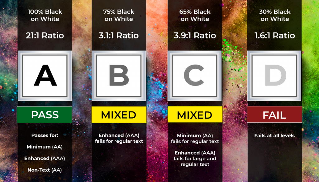
There are many examples we can give regarding color/contrast, but as you will soon find it is difficult to predict as what will pass, or fail is very dependent upon the design of your document and color palette being used. For example, here is an example for different shades of black and grey on white, but you would get different results if you used different colors for the text and background.
Color Contrast Checker
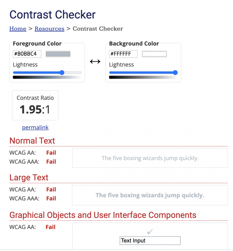
What this means is that you really need to test your work as you are developing it using a contrast tool to ensure you are adhering to the 4.5:1 requirement. There are some general rules to follow that are common sense such as using dark colors such as black, navy, dark green, maroon with a light background such as light grey, but the only way to be sure is to check your work with a color analyzer. A good tool you can download and install for testing color contrast is available from WebAim.
WebAim has some good examples of specific uses of color https://webaim.org/articles/contrast/#ratio but it is difficult to remember all the rules when designing your documents so best practice is to test the final results using a color/contrast analyzer tool to be sure that the document meets the requirements and is accessible.
In summary, color and contrast issues are a common problem with documents but can be easily solved by adding the best practice to your design work to test using a contrast analyzer tool and by following the guidelines in to ensure the color is not being used as the only means to convey differences.
Read the Entire Series Here
- Step 1: Tags & Reading Order
- Step 2: Metadata
- Step 3: Color & Contrast
