As an executive working for an accessibility solutions provider, I get to peer beneath the proverbial hoods of many businesses—meaning I get to witness the good, the bad, and the ugly of how organizations approach equitable access to information.
More often than not, the historical influences of accessibility initiatives have often been closely tied to two distinct drivers: compliance and the law. However, in the past few years, there has been a slow but steady shift to a more people-centric approach—more and more organizations are finally beginning to consider the human experience first. After all, accessibility shouldn’t be about legal issues; it should always be about real people and their unique experiences.
For this reason, we showcase real human experiences of people with visual impairments, how they navigate the world through modern technology, and what good VS bad interaction means to them.
Digital accessibility challenges of a user with vision impairment
For me, there is no better place to start than with my spouse—a person who began losing sight in her early twenties. Without too much medical jargon or detailed history, her vision was impacted by a bacterial eye infection that triggered the onset of ocular histoplasmosis, resulting in a complete loss of central vision.
My wife’s daily experience with technology is not unlike many others. For the most part, her assistive technology choices work incredibly well for her, enabling her to access the same things that everyone else does. However, on occasion, I can definitely hear the swearing and frustration emanating from the room next door, across the table, or sitting beside one another on the couch.
This is the human factor that so many people never think of—an otherwise typical digital, document, or print experience being very different (and potentially frustrating) for many people.
The ‘zoom’ feature and website pop-ups
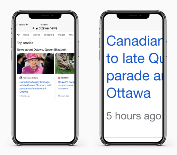
In my wife’s case, her choice of technology and subsequent reliance is on the zoom functionality built into her Apple products. Like extremely large print/text, if printed, her digital world consists of readying one to two words at a time that take up the entirety of the screen.

As websites go, the majority of regular business sites work fine. The poor experiences usually begin with pop-up banners—popular on eCommerce or service provider sites—directing to alternate pages, offers, etc. These pop-ups typically get lost in the magnification function and become difficult to “target” mid-screen from mouse usage.
Mobile apps are rarely an option as the zoom function is simply unavailable, or the “large text” option isn’t large enough or reflow text, making it nearly impossible to read or comprehend.
HTML-based emails
And lastly, HTML-based email can also be difficult, especially regarding e-billing from service providers such as telecom, banking, etc. For one, the number of times she has unknowingly (and unwillingly) been “opted out” of large print billing by companies to reduce environmental impacts is so high it can no longer be counted. Additionally, many e-bills seem to not work or play well with her chosen tech—hence the requirement for large print.
Of course, the idea behind this article is not to outright solve particular challenges that people may have. In this case, my wife is a rockstar who, for the most part, navigates information access just as well as anyone else—the only difference being technology and print choices.
The actual reasoning of these articles is to remind companies that not every experience is the same. Ensuring equitable access to information and making experiences as simple and seamless for anyone regardless of the situation is something that all organizations must strive for—and it starts by understanding the human element.
